
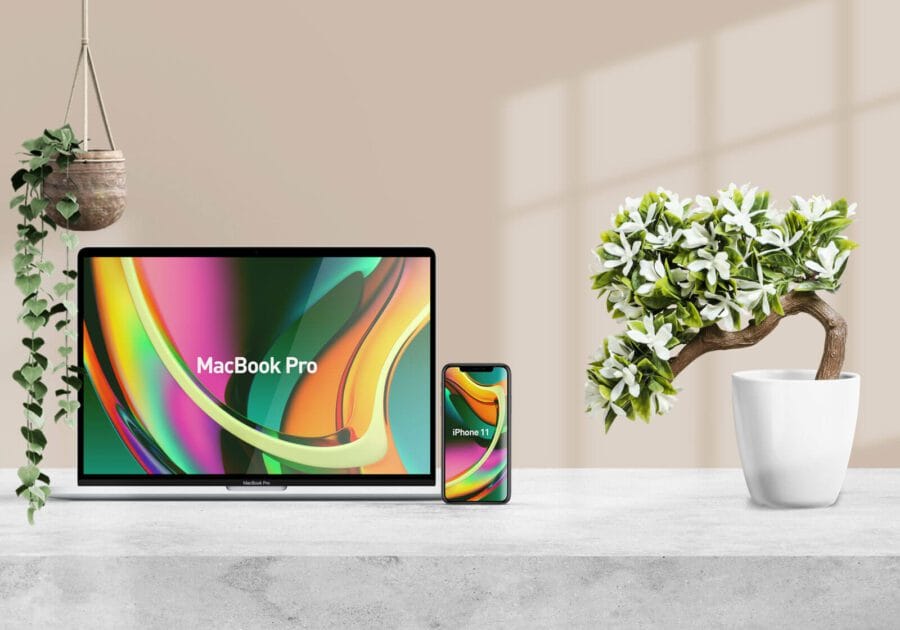
If you need to present responsive website or app designs for desktop and mobile in a clean, realistic way, check out our new free responsive mockup. It features high-quality renders of a MacBook and iPhone 11 pro displayed in a modern scene.
Using smart object layers, you can easily insert your desktop and mobile designs which will appear seamlessly across both devices. The mockup perfectly aligns the interface transition between the two screen sizes.
A responsive mockup like this is ideal for showcasing a cohesive multi-device user experience. It produces impressive visuals that can be used for everything from marketing materials to client presentations and portfolios.
The mockup features:
- PhotoRealistic MacBook Pro and iPhone 11 pro models with precise details
- Beautiful lighting into the scene
- Smart object to change the screen by a few clicks.
The PSD file is available now in our mockup resource library. Download it today to create stunning visuals that will make your responsive web and app designs look their best.


